

Divi Review Builder lets you display published reviews in grids, walls of love, carousels, sliders and moving marquees.
The easiest way to get started is with a Starter Layout. Its review modules and loop settings are already connected.
Step 1: Add some published reviews
Before building your page, make sure you have reviews available.
Go to Reviews → All Reviews and add a review or publish an existing submission.
Pending, draft and password-protected reviews are excluded from public review displays.
Step 2: Choose a Starter Layout
Open the Starter Layout importer and select a design, such as:
- Classic wall of love: A grid of review cards.
- Editorial masonry wall of love: A layout with cards of varying heights.
- Multi-card carousel: Several reviews with navigation controls.
- Showcase carousel: A carousel featuring a highlighted review.
- Spotlight slider: Individual reviews with profile-picture navigation.
- Column, Dual or Stacked marquee: Reviews that move continuously.
Import your chosen layout into the Divi Library.
See Importing Starter Layouts for the full import instructions.
Step 3: Insert the layout
Open your page in the Divi Visual Builder.
Click Add Section → Add From Library, select the imported layout, then click Use This Section.
Step 4: Choose which reviews appear
Starter Layouts use Divi’s native Loop Builder to display your reviews.
Find the element with Loop Element already enabled and open Content → Loop. Depending on the layout, this may be a Review Card or a containing Group.
The query should use:
- Query Type: Post Type
- Post Type: Reviews
To display a specific group of reviews, use the loop’s taxonomy filters to select the relevant Review Collections.
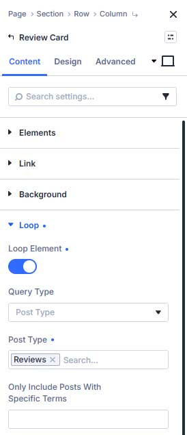
You can also adjust the review limit and sorting. Choose Review Order (assigned first) if you want to use the order numbers assigned in the Reviews dashboard.
Keep the existing loop on its configured element. Adding another loop to its child modules can create duplicate or incorrect output.
Step 5: Customize the design
Each review card contains editable elements. Open their settings to adjust typography, colors, backgrounds, borders and spacing.
For example:
- Review Rating controls the review’s stars.
- Review Media controls its image or video presentation.
- Native Text and Heading modules display review details.
- A native Image module can display the reviewer’s profile picture.
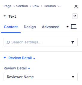
Text, Heading and Image modules connect to review information through Content → Review Detail. Keep these connections enabled so each card displays information from its own review.
Step 6: Adjust the layout
Use the layout’s existing controls to configure its presentation.
For grids, adjust the parent container’s columns and gaps. For carousels and sliders, use the native Group Carousel settings. For moving layouts, use the Review Marquee settings.
Check desktop, tablet and phone previews before saving.
Step 7: Save and check the frontend
Save the page and exit the Visual Builder.
Check that the correct reviews appear, the layout fits your screen, and any navigation or video controls work.
Building your own review card
You can also start from scratch by adding a Review Card, enabling its Reviews loop, and inserting child elements through Content → Elements → Add Element.
Add Review Rating, Review Media and native Text, Heading or Image modules, then connect the native modules using Content → Review Detail.
You only need to design one card—the loop repeats that design for the selected reviews.